REIT Style Guide
2017
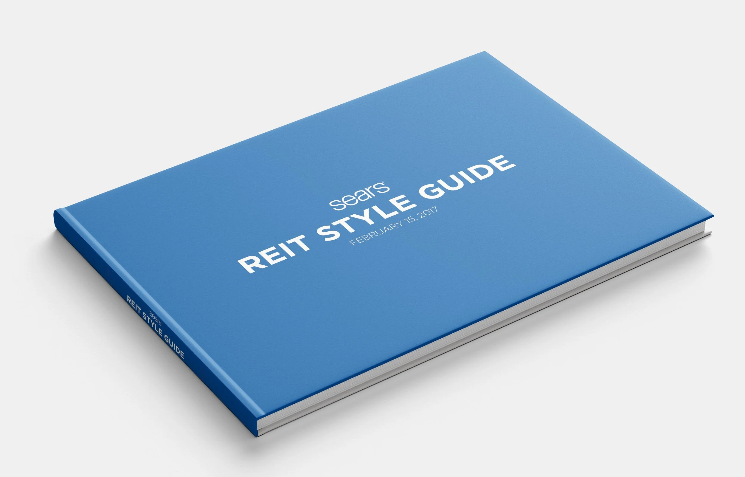
In 2017, Sears stores embarked on a transformative phase marked by closures and downsizing initiatives. In response, our Integrated Member Experience team undertook the strategic mandate of developing a comprehensive style guide tailored specifically for the evolving landscape of smaller stores, including newly introduced Appliance and Mattress outlets. Our overarching objective was to optimize revenue generation within constrained spatial parameters while concurrently streamlining operational costs. The guide encompasses a holistic approach delineating store configurations, stylistic elements such as typography and color palettes, and innovative signage solutions, all meticulously curated to enhance the overall shopping experience and maximize operational efficiency.
Style Guide
Our style guide was an important part in ensuring that our stores were matching our goals and standards. The full guide includes information on various aspects of the store, including:
-
• Make more money in less space
• Provide centralized service area to reduce operational expenses
• Offer inspirational solution-based merchandise assortments that are customized to member and localized data
• Feature specially priced, limited offerings in Hot Zones/Flex spaces throughout the store
• Improve Member experience with updated visual elements
• Upgrade mall and exterior entrance, flooring and wall finishes and all key member touch points, including restrooms, checkout, fitting rooms and MPU
• Update way finding and storewide signing package
-
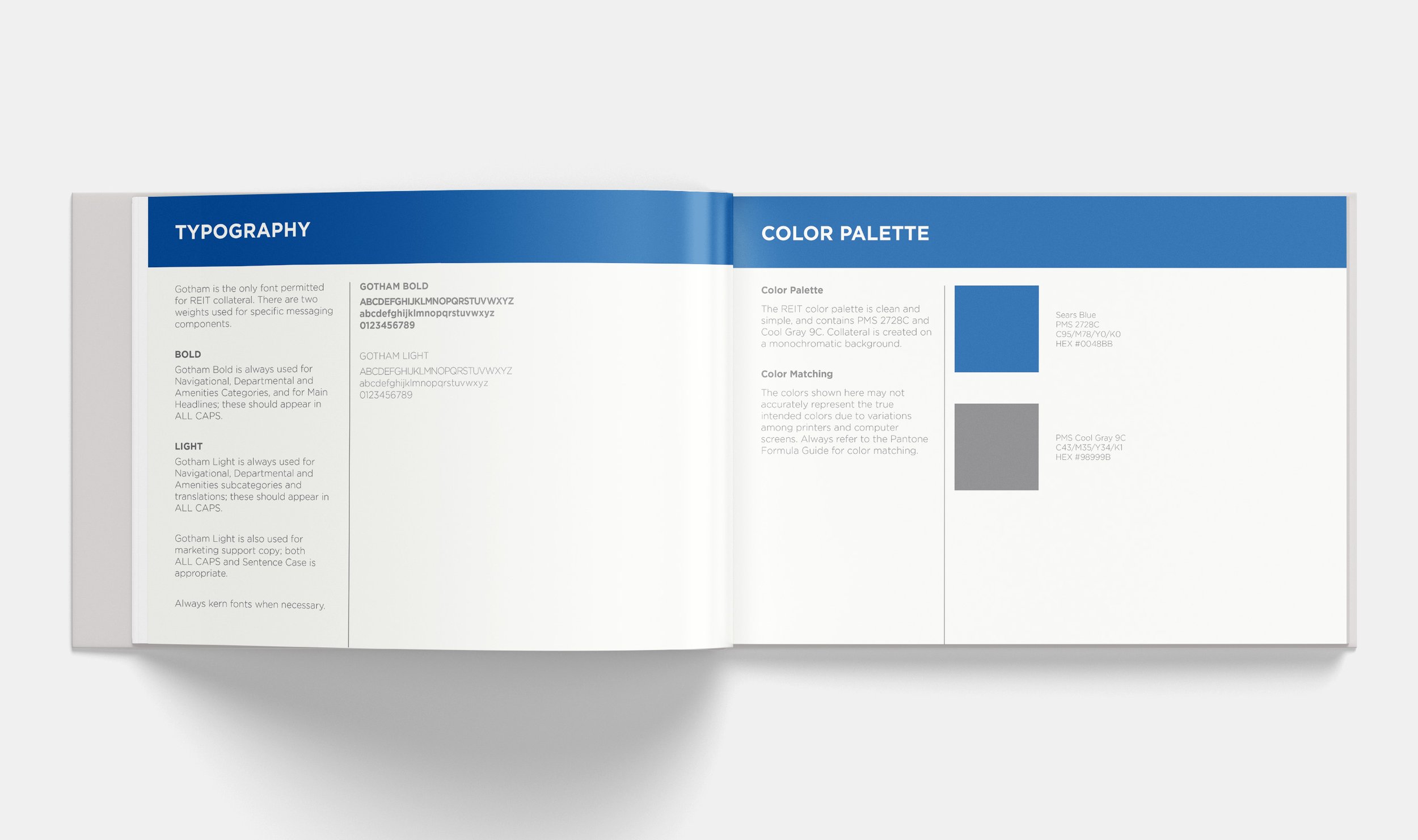
• Typography
• Color Palette
• Floor & Ceiling Finishes
• Vector Icons
-
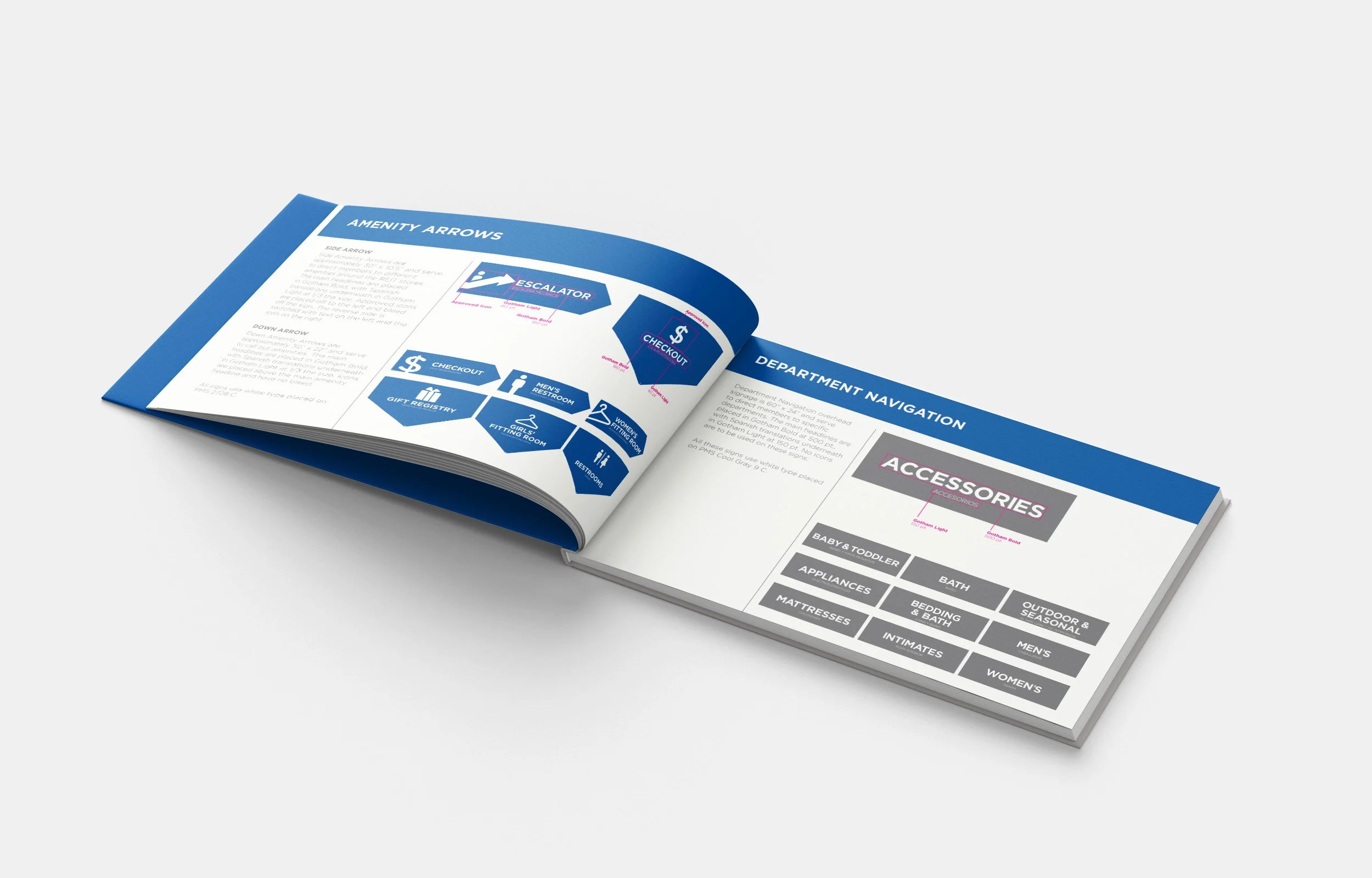
• Amenity Arrows
• Department Navigation
• Operational Signage
• Under Construction
• Grand Opening


