Cameron’s Coffee Redesign
2014
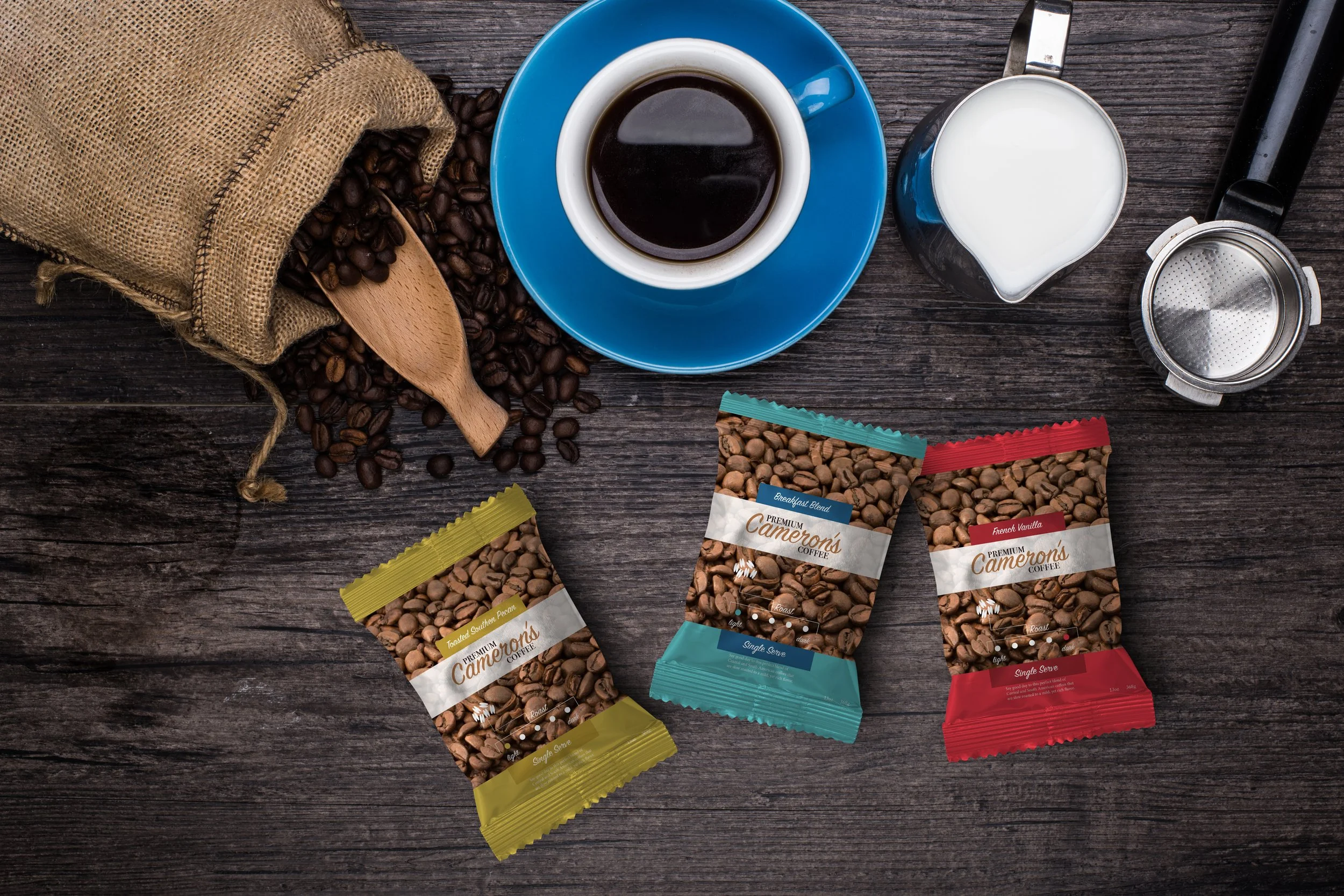
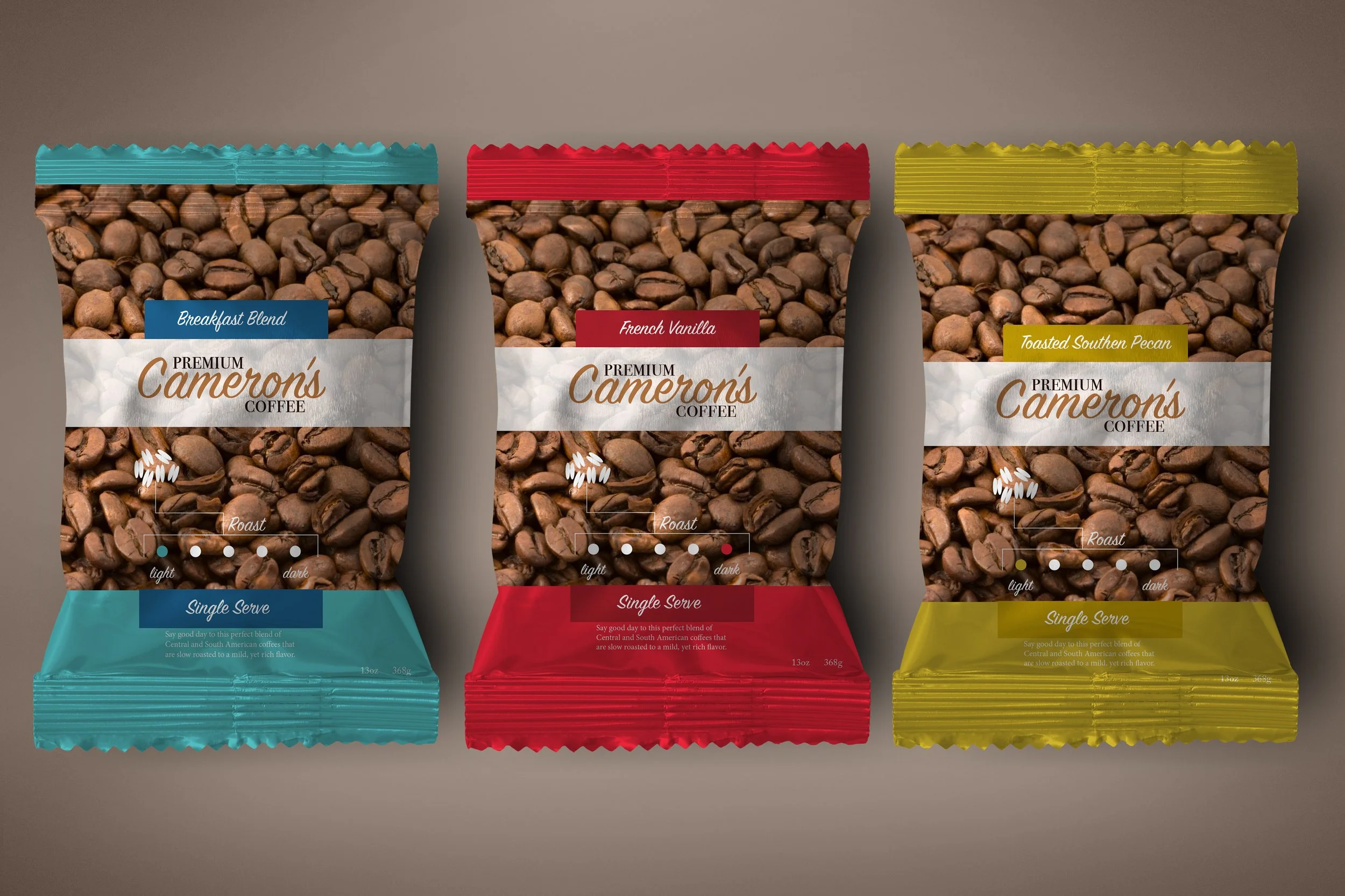
During my tenure at Columbia University, I engaged in a project aimed at rebranding the packaging of a prominent product. With a penchant for coffee, I selected Cameron’s Coffee as my focal point. The primary objective was to develop packaging that would elevate the brand's presence amidst its competitors on store shelves. Drawing inspiration from color theory and the captivating allure of photography, particularly emphasizing the rich texture of coffee beans, I crafted a design intended to captivate consumers and invite them to savor the exquisite experience of Cameron’s Coffee.
Coffee, coffee & coffee
In my endeavor to enhance the packaging of Cameron’s Coffee, I strategically incorporated vivid imagery of coffee beans to succinctly convey the essence of the product. Recognizing the importance of shelf appeal, I introduced a distinctive approach by altering the design layout of the K-cup boxes. Notably, one side now showcases the flavor profile, while the opposite side exclusively features the coffee bean imagery alongside the brand logo—a deliberate choice aimed at facilitating dynamic and visually striking shelf arrangements. This innovative strategy not only fosters enhanced consumer engagement but also elevates the brand's visibility and allure within the retail environment.


